Vibrant Purple, Bold New Lettering, This Is A Logo Built For The Modern Age!
We are thrilled to announce the unveiling of our new branding, a fresh set of designs that captures the essence of our evolving identity and ambitions. As we continue to expand our presence across the music, apparel, and gaming industries, we felt it was time for a bold and unified visual representation that reflects our passion, vision, and precision.
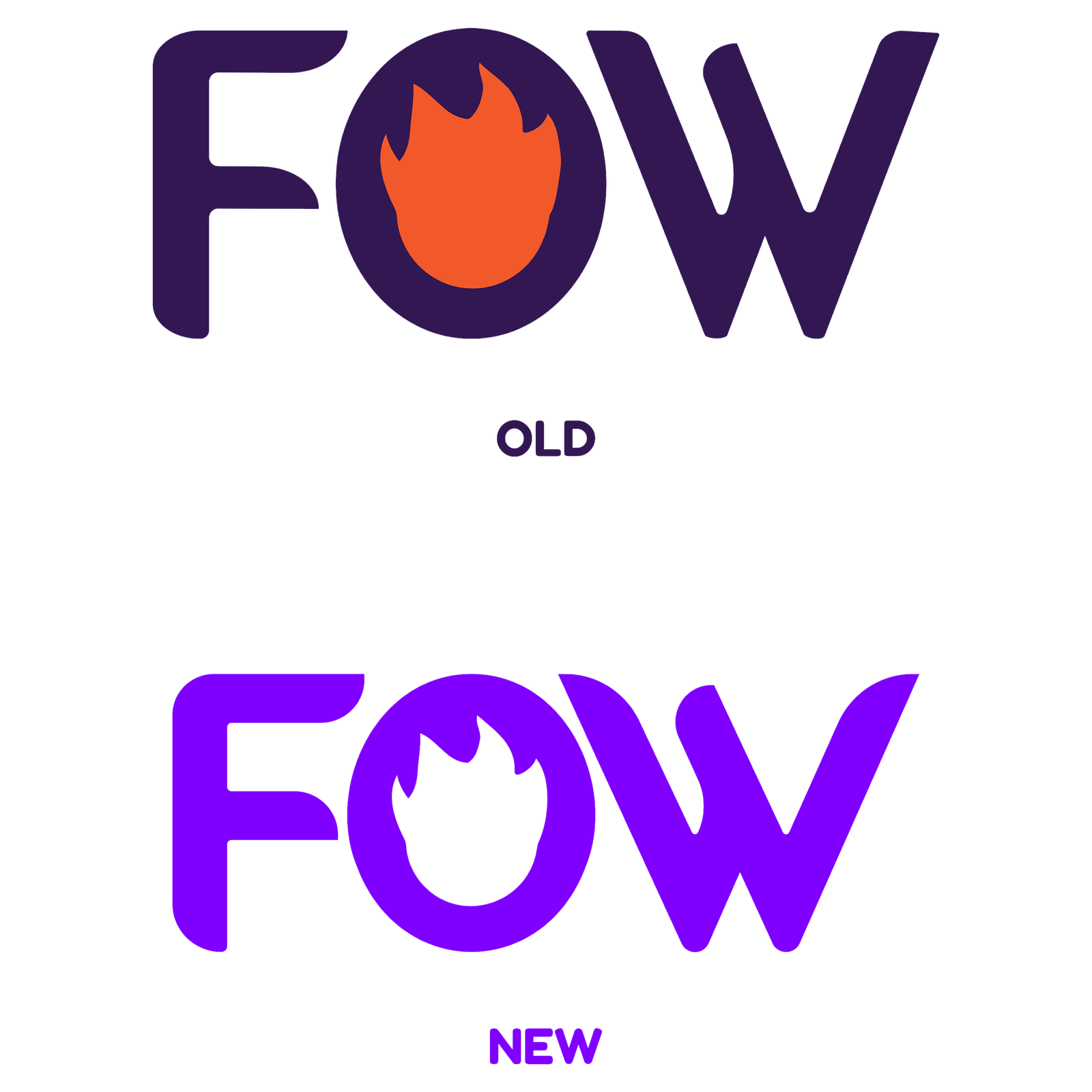
Out with the old, in with the new.
Our previous branding, while simple and effective, lacked the boldness that truly represent our vision today. The old design featured thinner, more rigid lettering that didn’t fully capture the boldness and passion behind our brand. The old branding’s color scheme posed several challenges that didn’t align with our evolving identity. The dull purple, often fell flat, especially against darker backgrounds. It lacked the vibrancy needed to stand out. Additionally, the bright orange accents, though meant to inject energy, came off as too tacky, clashing with our desired sleek, modern aesthetic. The result was a color palette that felt disjointed and inconsistent with the bold, innovative brand we aim to be.
A Bolder, Thicker Font for a Stronger Identity
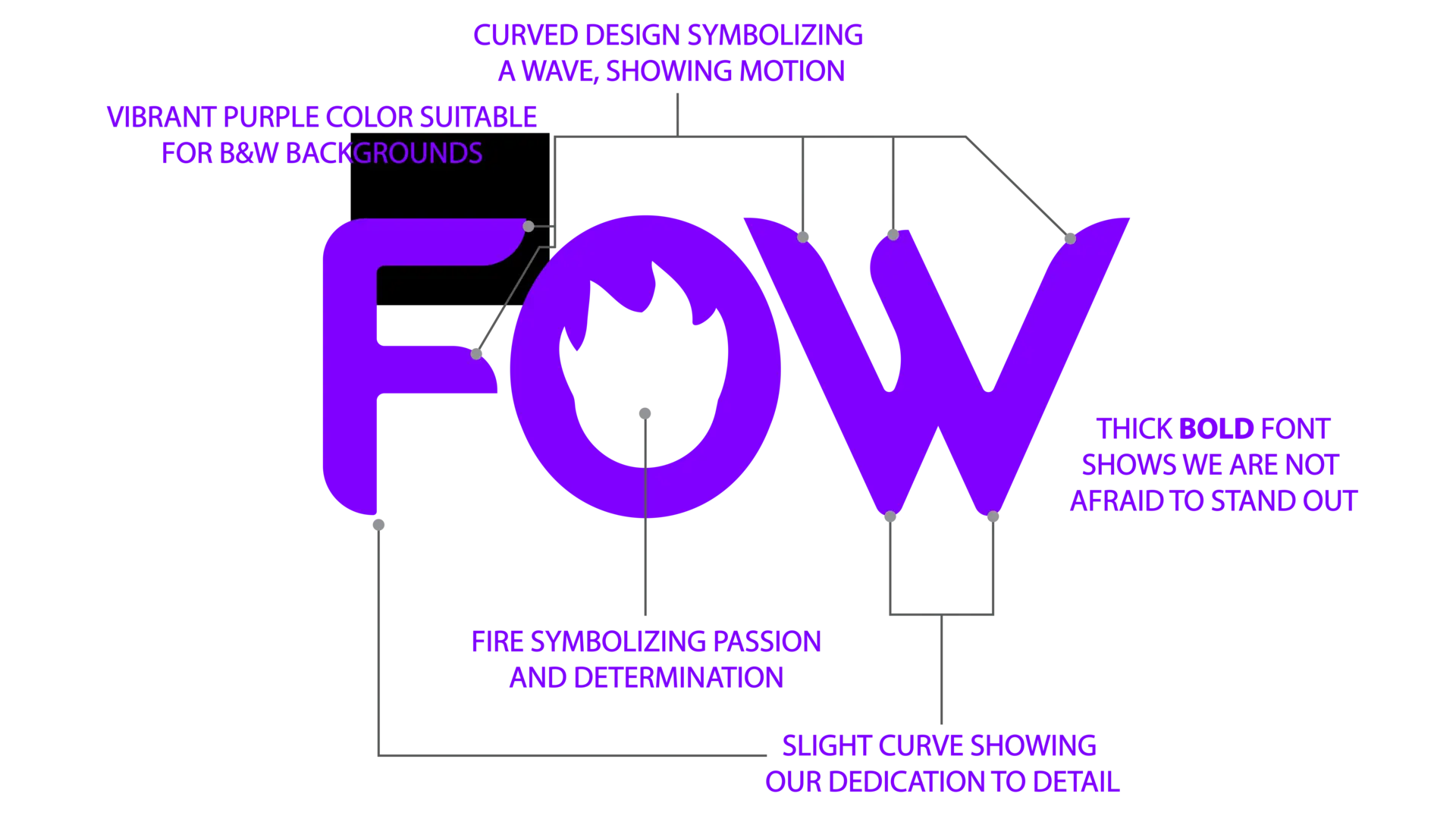
At the core of our new branding are the same familiar letters “FOW”—this time with a more pronounced and thicker font than before. Each letter is designed to stand tall and proud, evoking the solid foundation upon which Fyre Out Wxst is built. This new refined Modern Sans font choice represents a unified brand across all our ventures, from our multi-media and music ventures to our apparel line and game studio.
Curved Edges to Represent A Wave, Showing Motion and Fluidity
The curved edges of the branding are not just for aesthetics—they symbolize a wave, signifying continuous motion and progression. We wanted to communicate that Fyre Out Wxst is not static; we are always moving forward, adapting, and evolving. The wave also pays homage to our SoCal roots, where beautiful beaches are an integral component of our cultural heritage.
The Refined Flame in the “O”
A focal point of the logo is the flame that burns within the “O.” This fiery symbol is a visual representation of the passion and determination that fuels everything we do. At Fyre Out Wxst, we are driven by a relentless desire to push boundaries, create impactful art, and inspire future generations. The flame embodies the heat of our ambitions and the burning desire to leave an indelible mark across all industries. The flame also represents the fire of the Holy Spirit, which guides us and empowers our endless creativity. God is the almighty creator of the universe, and we are made in His likeness, therefore we were created to create!
Vibrant Purple: Versatile and Striking
Color is crucial in setting the tone for a brand, and we chose a vibrant shade of purple for our new branding. Not only does it stand out as a dynamic and modern color, but it’s also highly versatile—working seamlessly against both light and dark backgrounds. At Fyre Out Wxst, we believe that passion, empathy, and creativity are the driving forces behind our brand, and our rebranding campaign is an expression of all three. This vibrant shade of purple speaks to our ambition, and it underscores the idea that being driven isn’t about being cutthroat; it’s about having empathy and kindness for everyone we work with. God is love and through love we believe that we can bring everyone together.
The Perfect Balance: Curves that Showcase Our Attention to Detail
Finally, the slight curves on the letters themselves reflect our meticulous attention to detail. We wanted this branding to feel inviting and open, not sharp and aggressive. Every element of this branding was carefully considered, balancing boldness with elegance. This refinement highlights our commitment to precision and our dedication to producing high-quality work—whether in music, fashion, or gaming.
In conclusion, our new branding is more than just a design—it’s a reflection of our values, our vision, and our commitment to creating a lasting impact. Fyre Out Wxst as a brand is passionate, moved by the Holy Spirit, and dedicated to shaping the culture for Jesus! We look forward to seeing this branding become a symbol of everything we stand for, as we continue to ignite creativity and passion in all that we do.
HERE’S THE REVEAL VIDEO.

